
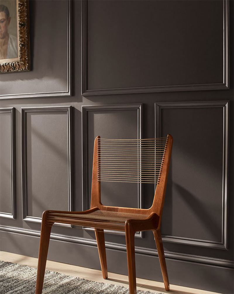
Interior design experts and paint manufacturers alike are predicting that 2026 will be all about warmth, personality, and connection to nature. Earthy neutrals, soothing greens, moody accent tones, and sophisticated deep hues are replacing stark whites and flat grays. These colors help create homes that feel cozy, expressive, and timeless — exactly what so many clients are looking for this year.
Here are the top trending paint colors for 2026, what they look like, and how designers suggest using them:
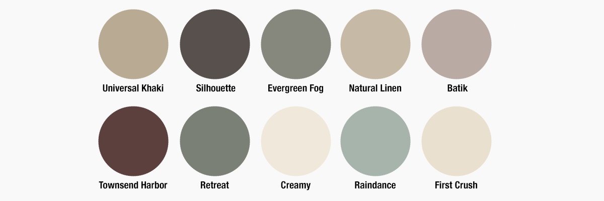
1. Sherwin-Williams — Universal Khaki (SW 6150)
What it is: A warm, earthy neutral that feels timeless and grounded. Named Sherwin-Williams’ 2026 Color of the Year, Universal Khaki is soft, versatile, and perfectly at home in transitional or casual interiors.
Why it’s trending: Designers are moving away from cool neutrals toward warmer palettes that feel more lived-in and comforting. Universal Khaki hits that sweet spot — warm but not yellow, neutral but not dull.
Best for: Living rooms, bedrooms, open floor plans
Style tip: Pair with crisp white trim or textured fabrics to make the hue feel intentional and layered.
2. Benjamin Moore — Silhouette (AF-655)
What it is: A rich, moody espresso-charcoal hybrid that’s dramatic without feeling cold. Benjamin Moore chose Silhouette as its 2026 Color of the Year and designers are calling it elegant and timeless.
Why it’s trending: This deep, luxurious color adds depth and personality — perfect for accent walls, cozy corners, or feature ceilings.
Best for: Dining rooms, home offices, bathrooms
Style tip: Balance Silhouette with lighter neutrals like warm whites for contrast and warmth.
3. Sherwin-Williams — Evergreen Fog (SW 9130)
What it is: A soft, muted green with gray undertones that brings a sense of calm and nature indoors.
Why it’s trending: Green continues its rise as a neutral alternative — soothing, organic, and versatile.
Best for: Bedrooms, bathrooms, offices
Style tip: Works beautifully with natural wood and woven textures for a spa-like vibe.
4. Benjamin Moore — Natural Linen
What it is: A warm, creamy neutral with just enough depth to feel cozy and intentional.
Why it’s trending: While whites are making a softer comeback, warm neutrals like Natural Linen offer a brighter backdrop that still feels warm and comfortable.
Best for: Full-home palettes, living rooms, kitchens
Style tip: Pair with wood tones and fieldstone accents for classic warmth.
5. Benjamin Moore — Batik (AF-610)
What it is: A dusty violet-rose hue that adds subtle personality without being overpowering.
Why it’s trending: Soft, earthy pastels are moving back into design favor, especially when paired with neutrals that keep them sophisticated.
Best for: Bedrooms, accent walls
Style tip: Complement with taupe or cream trim for a cohesive look.
6. Benjamin Moore — Townsend Harbor Brown (HC-64)
What it is: A rich, warm brown that adds depth and richness with a natural feel.
Why it’s trending: Deep, natural browns are replacing flat grays in spaces where warmth and coziness are priorities.
Best for: Libraries, hallways, accent features
Style tip: Pair with lighter neutrals like Swiss Coffee or Natural Linen to keep the palette balanced.
7. Sherwin-Williams — Retreat (SW 6207)
What it is: A calm, deep blue-green shade that bridges earthy greens and blue tonalities.
Why it’s trending: Designers love this tone for its ability to feel both restorative and statement-making.
Best for: Accent walls, bathrooms, kitchens
Style tip: Pair with soft neutrals and brass hardware for an elevated look.
8. Sherwin-Williams — Creamy (SW 7012)
What it is: A softly warm off-white that reads inviting and luminous without being stark.
Why it’s trending: Warm off-whites are becoming staples for ceilings, trim, and entire room palettes — offering brightness with softness.
Best for: Hallways, trim, ceilings
Style tip: Use as a base to let deeper colors like Retreat or Silhouette shine elsewhere.
9. Benjamin Moore — Raindance (1572)
What it is: A steely green with subtle gray undertones for a sophisticated but soothing finish.
Why it’s trending: Cool greens that balance both warm and cool tones are gaining traction for kitchens and bedrooms.
Best for: Kitchens, living rooms
Style tip: Pair with earthy woods for depth and warmth.
10. Benjamin Moore — First Crush (CSP-310)
What it is: A muted rose tone that reads both classic and contemporary.
Why it’s trending: Soft, earthy colors with a hint of hue bring subtle personal expression without dominating a space.
Best for: Accent walls, powder rooms
Style tip: Pair with cream tones like Swiss Coffee for a refined contrast.
Design Tips for Using 2026 Colors
Layer with Nature
Warm earth tones and organic greens work beautifully with natural wood floors and furnishings — making spaces feel welcoming and cohesive.
Balance Drama with Neutral
Use deeper accent colors like Silhouette or Townsend Harbor Brown against softer neutrals like Creamy or Natural Linen to keep rooms dynamic but not heavy.
Test Samples in Your Light
Always sample large swatches in your actual spaces — lighting changes throughout the day can shift perception dramatically.